


Hey! The world is all beautiful, colorful and natural so your User Interface should be. It is one of the most important parts of any website or application. Users usually don’t notice it when it performs well. But in case of errors and poor interface users lose the interest in the product. To create successful user interfaces, most designers follow the basic principles of interface design. Interface design principles represent high-level concepts that are used to guide software design. High level! Not that much
10 commandments are:
1. Place users in control of the interface
- The user must be able to reverse the action which allows the user to backtrack without the constant fear of failure.
- Create an easy-to-navigate interface during the website development process, so that user should enjoy exploring the interface even in case of complex software or loads of options available.
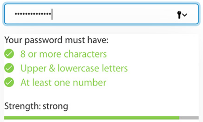
- Acknowledgment and feedback are the necessary needs of today’s complex and messy software. For example, when filling out a password field in the signup form, the interface might inform users of the requirements for their password.
- Using progress bars or other indicators makes the user patience while software or app is supposed to be doing something.
- Accommodate users with different skill levels by providing shortcuts, hotkeys and fast paths for expert users. For newbie users tutorial and explanation must be there.
2. Make it comfortable to interact with a product
- Eliminate all elements and irrelevant information that is not helping your users.
- Don’t push users to enter same info multiple time or vast info to fill.
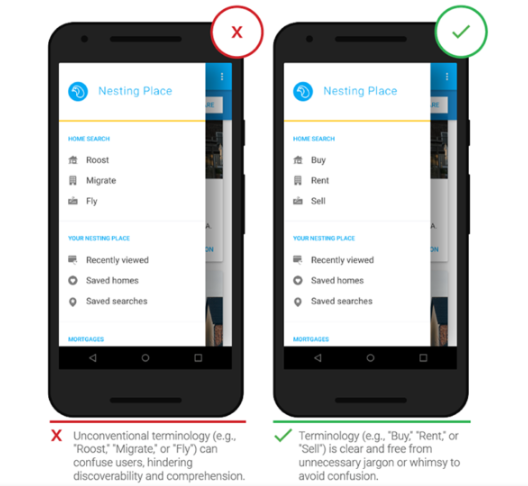
- Use terms throughout the interface that users can understand, rather than system or developer language.
- Fitts’s law states that the time to acquire a target is a function of the distance to and size of the target. This means that it’s better to design large targets for important functions (big buttons are easier to interact with).
- We should design an interface by keeping the requirement of users of all abilities, including those with low vision, blindness, hearing impairments, cognitive impairments etc.
- To simulate real world on digital interface metaphors play vital roles. For example, when asking debit card details for payment, you can use a similar picture of the real card as an example.
- Errors should be engineered as precise, polite, and constructive. If possible, errors must include the exact issue and solution.
3. Reduce cognitive load
- Cognitive load is the amount of mental processing power required to use a product. It’s better to avoid making users think/work too hard to use your product.
- According to a research, human working memory can handle seven-plus-or-minus two “chunks” of information while we’re processing information (Theory of CHUNKING by George Miller).
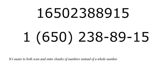
- Use 3 click rule to reduce the number of actions required to complete the task. The user of a product should be able to find any information with no more than three mouse clicks.
- Visibility of information and accessibility with ease makes the user recall and recognize what he saw recently in a software.
4. Make user interfaces consistent
- The main idea of consistency is the idea of transferable knowledge — let users transfer their knowledge and skills from one part of an app’s UI to another, and from one app to another app to have the consistency in website design.
- Don’t change the consistent look of visual styles within your product for no reason. For example, a Submit button on one page of your site should look the same on any other page.

- The principle of least surprise is the Functional consistency (Consistency of behavior). The behavior of interface controls, such as buttons and menu items, should not change within a product.
- To fulfill user requirements follow platform conventions, don’t reinvent patterns, and don’t try to reinvent terminology.
5. Light comes from the sky
- Shadows are invaluable cues in telling the human brain what user interface elements we’re looking at. When the light comes from the sky, it illuminates the tops of things and casts shadows below them.
- Same in the website development, home page tops of stuff are lighter, the bottoms are darker. Our screens are flat, but we’ve invested a great amount of art into making just about everything on them appear to be 3-D.
6. Black and white first
- To simplify the complex elements of the interface we need to first implement Grayscale responsive website design then should go for the colored version.
- It is better to start making the app beautiful and usable in every aspect, but without the use of colors, which is a little harder. So, add color after grayscale with a very purposeful and meaningful way.
- In some of the cases, it is not necessary to have a grayscale version or interface. Some designs are related to specific attitude — “sporty”, “flashy”, “cartoony”, etc. — need a designer who can use color extremely well. But most apps don’t have a specific attitude except clean and simple. Those that do are admittedly much harder to design.
7. Double your whitespace
For well-designed UI look, you need to add in a lot of breathing room. Sometimes in a ridiculous amount. For this designer needs to remind few things in his mind:
CSS, HTML, and Whitespace
- If you, like me, are used for the formatting of the CSS, where mostly the default is no whitespace, don’t try those poor methods and train yourself for new ones.
- While designing a software start using whitespace as the default. Everything starts as whitespace until you take it away by adding a page element.
- Starting with a blank page means starting with nothing but whitespace. You think of margins and spacing right from the very beginning. Everything you draw is a conscious whitespace-removing decision.
- Starting with a bunch of unstyled HTML means starting with content. Spacing is the afterthought. It has to be explicitly stated.
8. Learn the methods of overlaying text on images
For reliably and beautifully overlaying text over images we have certain concrete methods.
Method 1: Apply text directly to the image
- The image should be dark.
- The text has to be white.
- Test it at every screen/window size to make sure it’s legible
Method 2: Overlay the whole image
- It is the trendiest method today to overlay the image.
- For bright images, translucent black is the best option also you can find colored overlays as well.
Method 3: Put text in a rectangle
Semi-transparent black rectangle and lather on some white text allow any image underneath and text will be clearly visible and legible, you can also add some colors.
Method 4: Blur the image
To make the overlaid text more legible we need to blur part of the underlying image. You can also use the out-of-focus area of a photo as the blur.
Method 5: Floor fade
- The floor fade is when you have an image that subtly fades towards black at the bottom, and then there’s white text written over it.
- To look most natural to our eye, the image has to be slightly darker at the bottom, just like everything else we ever see.
9. Make text pop — and un-pop
The styling of text matters the most preferably larger and lighter. Text includes multiple features to be reminded like Size (bigger or smaller), Color (greater contrast or lesser; bright colors draw the eye), Font weight (bolder or thinner), Capitalization (lowercase, UPPERCASE, and Title Case), Italicization, Letter, and Margins. For a visible and clear website design, text plays the most important role in improving UI and UX.
Up-pop and down-pop
- You can divide all the ways of styling text into two groups:
- Styles that increase the visibility of the text. Big, bold, capitalized, etc.
- Styles that decrease the visibility of the text. Small, less contrast, less margin, etc.
Selected and hovered styles
Styling selected elements and hover effects are another round in the same game— but more difficult. Usually, changing font-size, case, or font-weight will change how large of an area the text takes up, which can lead to seizing hover effects.
10. Only use good fonts
The clean and simple font is the necessity of a well-designed UI. Sites having unique features include very distinct text depends upon the flavor like sports, online games, and business sites etc. There are some useful resources for a smooth and soothing website design:
- There are some useful resources:
- Beautiful Google web fonts. This is an awesome showcase of how good Google Fonts can look. I’ve returned to this simple page for inspiration at least a dozen times.
- Font Squirrel. A collection of the best fonts available for commercial use, and totally free.
- Type kit. If you are on Adobe Creative Cloud (i.e. subscription Photoshop or Illustrator, etc.), then you have free access to a ton of amazing fonts. And yes, Proxima Nova is included.