


We often don’t know why we do things
One of the research studies proving this point was carried out around 50 years back by psychologists Timothy Wilson and Richard Nisbett. The researchers placed a table outside a store with a signboard that read, “Consumer Evaluation Survey: Which is the best quality?” On that table, there were four pairs of ladies stockings, labeled A, B, C and D from left to right. Most of the people i.e. 40% preferred D, and fewest people i.e. 12% preferred A.
The fact was, all the pairs of stockings on a table were identical. The reason most people preferred D was simply a position effect: the researchers knew that people show a marked preference for items on the right side of a display (another finding from psychology). But when the researchers asked people about the stockings that they chose, people identified an attribute of their preferred pair, such as its superior knit, sheerness or elasticity.
The researchers also asked people if they would have been influenced by the order and placement of the items, but with one exception (a psychology student who had just learned about order effects) nobody thought this had affected their choice. Instead, people made up plausible reasons for their choice.
So, there are a few very important factors which should be reminded while working on UX during mobile application development
- , website development and design, etc.
- Size and Location
- Attention (Hick’s Law and Serial Position Effect)
- Empathy Mapping
- Positive Reinforcement
- Facts to believe
UX is also about the size and location of controls
According to Fitts’ law (named after the psychologist Paul M Fitts), the time required to rapidly move to a target is a function of the distance to and the size of the target. This applies to both desktop user interfaces as well as touchscreen interfaces. In practice, Fitts’ Law doesn’t mean you should just make big buttons but that you should increase the clickable area. For example, allow a user to click on the text label next to a form field to place their cursor in the field for data entry.
Attention (Towards User’s Psychology)
There are different sorts of attention, based on the situation and the strength of the stimuli.
As a UX designer, we must be very well aware of the important factors of in-depth changes. These changes within the UX environment always draw the attention of the user. With this kind of expertise and experience in website development and design, we can sensibly design user experiences that must be the best fit for the User.
It could be a CMS customization or mobile application development or any other sort of customized software solution:
As a UX Designer, we should better know that during the learning and working activities the users need to use their constant attention. It means that everything on the user interface should deliver this purpose.
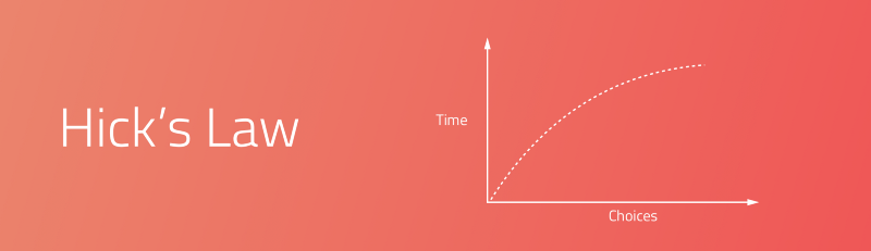
Too Many Options and Choices (Hick’s Law)
More choices and options need more mental load. “It describes the time it takes for a person to make a decision as a result of the possible choices he or she has: increasing the number of choices will increase the decision time logarithmically.”
Serial Position Effect: A way to create better user interfaces
The serial position effect, a term coined by Hermann Ebbinghaus, a German psychologist and a leader of memory research, describes how the position of an item in a sequence affects recall accuracy. There are two main concepts involved in the serial position effect:
- The Primacy Effect: Items that are presented at the beginning of a list are recalled with greater accuracy than items in the middle of a list.
- The Recency Effect: Items that appear at the end of a list are also more likely to elicit better recall than items presented in the middle of a list.
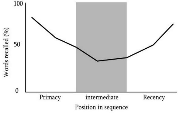
There are a few ways you can design better UX by understanding how the serial position effect affects your user:
- We should maintain information related to tasks within the User Interface.
- Include cues and notion in the User Interface.
- Limit the amount of recall required.
- Emphasize and highlight key information in the beginning and end.
Empathy Mapping:
s the name suggests, empathy maps simply help us building empathy with our end users. Based on real data and when combined with other mapping methods, they can:
- Remove the bias from designs and brings the team on a single, shared vision of the user.
- Brings out weaknesses in the research and understanding of the design.
- Brings to light new user requirements that the user themselves may unaware of.
- Need to understand what influence the user’s behavior.
- Guide us toward meaningful innovation and advancement.
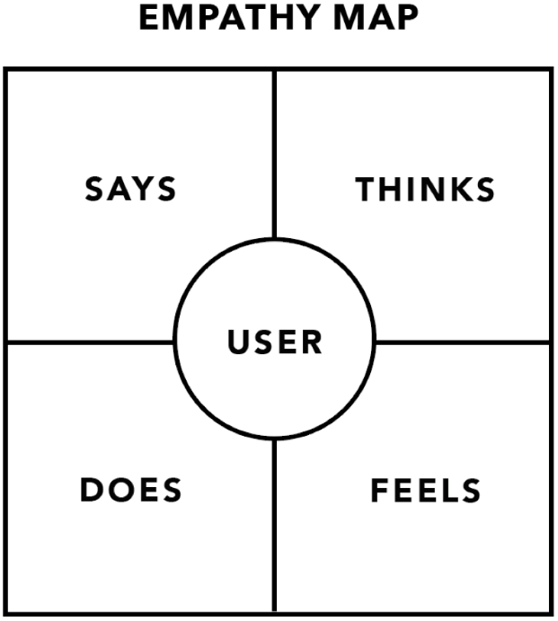
“Pay attention to what users do, not what they say.”— Jakob Nielsen
Using a Positive Reinforcement In UX
Positive reinforcement is only encouraging an action by rewarding it.
Positive reinforcement can be used in two ways. The first, if you are making use of an unorthodox website design features, a contemporary navigation, or out of the way architecture, you can train your users to handle it appropriately and master it by rewarding their interaction with it.
The second, and much more across the board, the application is to impose it on the platform as a whole. You are not bringing any behavior or habit into existence. You are simply wanting to encourage continued and repeated use of the website or mobile app in general.
Few facts to believe in:
3 Click Rule
This rule states that most probably, users will leave a website if they can’t get to the desired page they want, within 3 clicks.
5 Second Test
A 5-second test includes showing users the interface of a software application or a website for 5 seconds. Participants then have to recall what they saw on the page. This is one of the great methods to see whether the interface, features, or calls to actions has been correctly placed and has a correct impact.
80/20 Rule
This is based on the Pareto principle. Applied to any website, web app, or software environment, 20% of the functionality and features will be responsible for 80% of the results.
A/B Testing
A/B testing is a when you test two different versions of online content with users to see which one they prefer.
Accessibility
Accessibility is the ease with which people can use and understand a website or app. This also refers to how websites and apps are adapted for those with disabilities or special needs. An example of this could be adapting colors to allow people who are color blind.